Lyft

Staff Product Designer

Match choreography: what a rider sees in the minute between booking a ride and a driver showing up.

Overview

You book a Lyft and then you wait. It is a short gap and the most anxious part of the ride, and it was being filled with a countdown to when you would be matched with a driver.

I owned that stretch of the rider experience. It started as a fix for one screen that was making people cancel and ended as a single status framework other teams built on.


The countdown

The screen was built to show driver details, which research said riders wanted more than a pickup time. Then it had to say something about the wait, and a countdown that expires while you are still on the kerb reads as the app giving up on you.

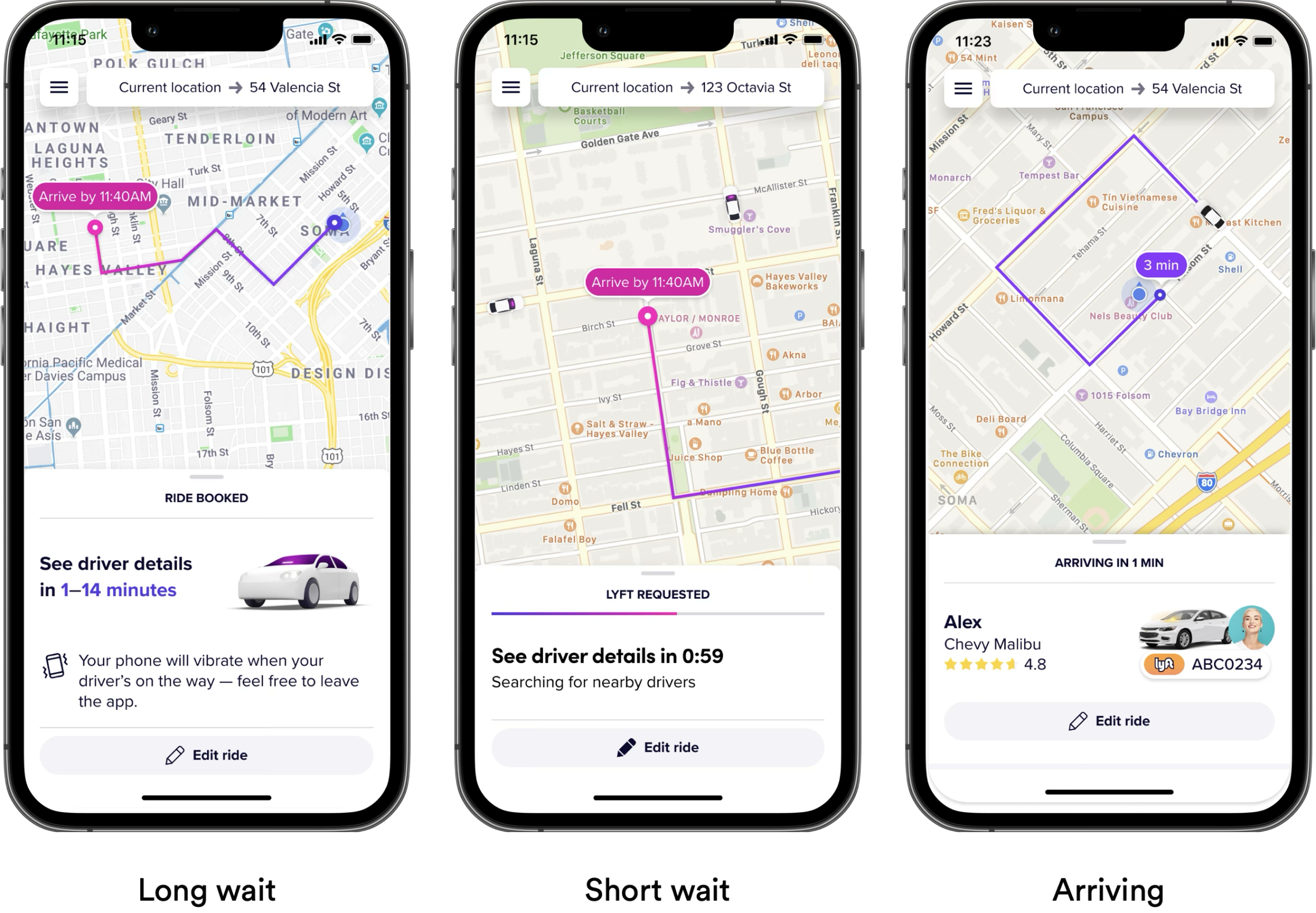
The post-request screen before the countdown was added
The same screen with the countdown to a driver match

One screen, not two

A long wait and a short wait were two different screens, and a rider crossing between them watched the interface change under their hands. The split existed because the server only knew whether you had been matched, or that you would be in more than sixty seconds. Moving that decision server side let one screen carry the whole range.
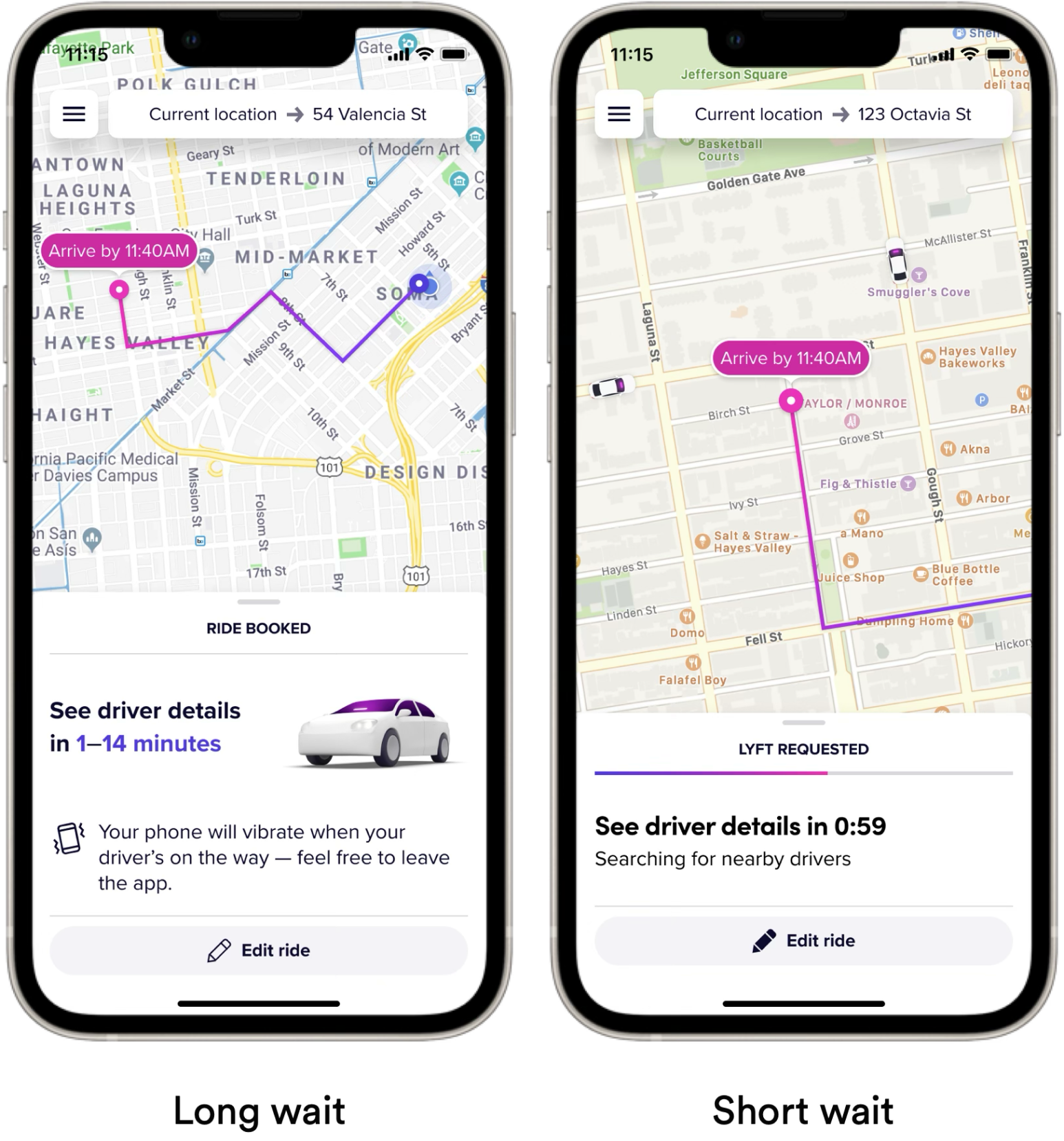
The long-wait and short-wait screens side by side

What shipped

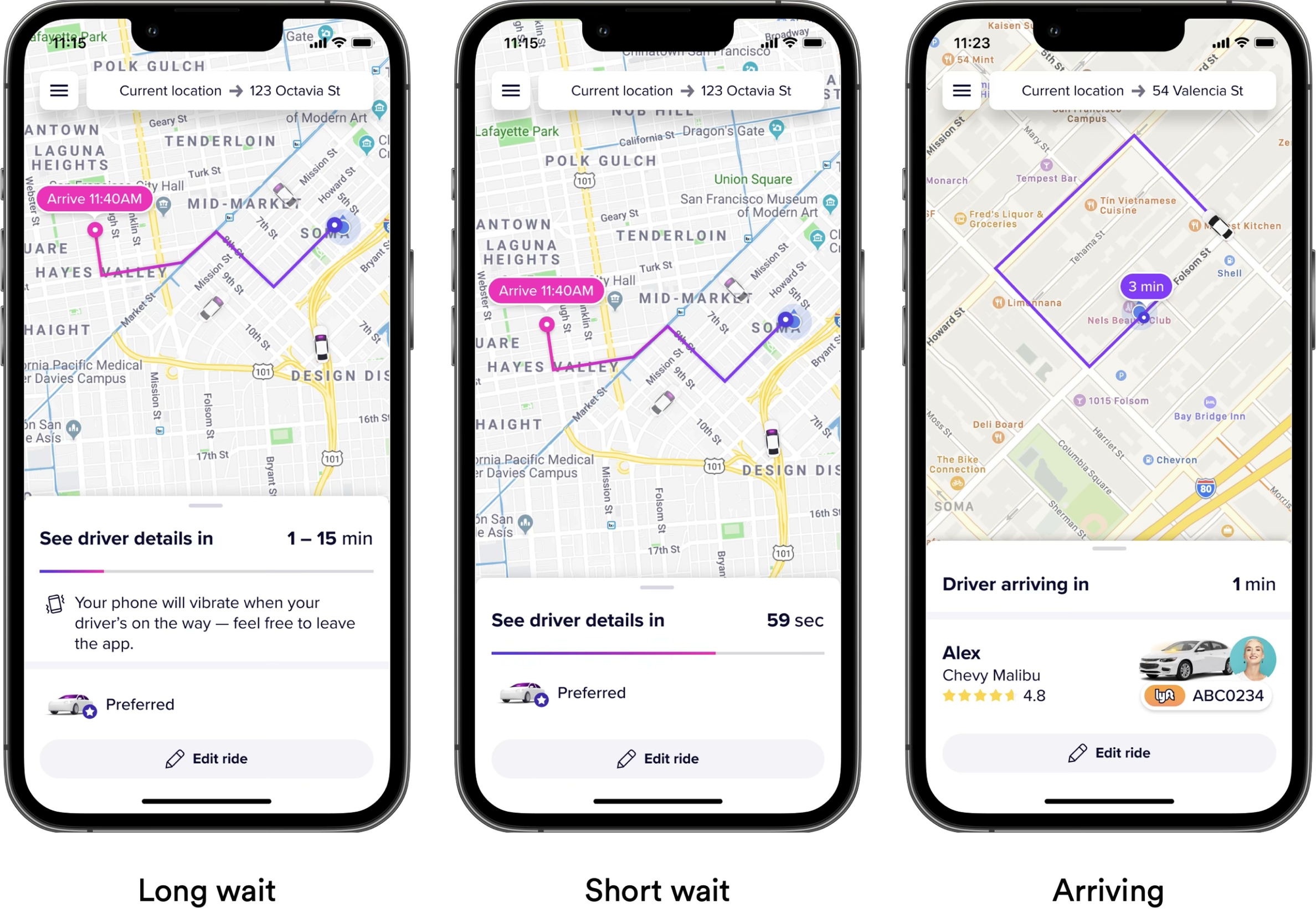
Drag the handle across the three states. On the left is what riders had: every screen announcing its own status — ride booked, Lyft requested, searching for nearby drivers — and a countdown running down to nothing. On the right is what shipped: one screen across the whole wait, giving a range while the estimate is still a range and narrowing it as the car gets close.

Cancel rates fell 10% in the learning period and 4% on switching, and because it shipped as a framework rather than a screen, scheduled rides and airports built on it.

BeforeShipped
The shipped post-request states: long wait, short wait, and arriving, on one framework
The original post-request screens: ride booked, Lyft requested with a countdown, and arriving